Azany

Azany

Cross-Country Web E-commerce Solution

Cross-Country Web E-commerce Solution

Introduction

Azany is an innovative e-commerce platform designed to break down geographical barriers in online shopping. Similar to Amazon in its vast product range, Azany distinguishes itself by allowing users to shop for country-specific items from around the world. This case study explores the design process behind Azany, highlighting how user-centered design principles were applied to create an intuitive, engaging, and truly global shopping experience.

Client

Azany (E-commerce startup)

Duration

July 2021 -

My Role

As the lead Product Designer for Azany, I spearheaded the design process through the following key phases:

  • Discovery & Research: Conducted extensive user interviews, market analysis, and competitive research across multiple countries to define global user needs, app functionalities, and market positioning.
  • Information Architecture & Wireframing: Developed the app's complex structure to accommodate both shoppers and vendors, creating initial design concepts for multiple user flows.
  • High-Fidelity Prototype Creation: Designed interactive, polished prototypes for both mobile and web platforms, ensuring a consistent experience across devices.
  • User Testing & Iteration: Led multiple rounds of user testing with diverse international participants, iterating on designs based on feedback.

Understanding the Challenge

The primary challenge was to design a global e-commerce platform that seamlessly integrates country-specific shopping experiences while maintaining a user-friendly interface for both shoppers and vendors. The app needed to:

  • Facilitate Easy Country Selection: Allow users to effortlessly browse products from specific countries.
  • Provide Intuitive Navigation: Create a clear and familiar e-commerce interface while incorporating unique features like country-specific catalogs.
  • Ensure Transparent International Shopping: Clearly communicate shipping costs, delivery times, import regulations, and currency conversions.
  • Implement Robust Search and Filter Options: Enable users to find products efficiently across different country catalogs.
  • Support Vendor Operations: Provide an intuitive interface for vendors to list products, manage inventory, and track earnings.
  • Integrate Secure Wallet Functionality: Implement a wallet system for both shoppers and vendors.

The goal was to create a platform that empowers users to shop globally as easily as they would shop locally, while also providing vendors with tools to reach a global market.

Research & Define

The design process began with comprehensive discussions with Azany stakeholders and potential users across multiple countries. Key questions addressed included:

  • Target Audience: Who are the primary users? What are their shopping habits and pain points with international purchases?
  • Country Selection Process: How will users navigate between different country catalogs?
  • Product Sourcing and Authenticity: How will Azany ensure product authenticity and manage inventory across countries?
  • Shipping and Logistics: How will international shipping be handled? What about returns and customer support across different countries?
  • Payment Methods and Currency Conversion: Which payment options and currencies will be supported for international transactions?
  • Legal Considerations: How will Azany handle varying import regulations, taxes, and consumer protection laws across countries?
  • Vendor Experience: What tools do vendors need to effectively sell internationally?

A comparative analysis of competitor apps and similar products was conducted, including platforms such as Amazon, AliExpress, Wish, Etsy, and country-specific e-commerce sites.

Key Insights from Market Research

  1. Target Audience:
    • Global shoppers interested in products not available in their home countries.
    • Expatriates looking for familiar products from their home countries.
    • Gift shoppers seeking unique international items.
    • Small to medium-sized businesses looking to expand internationally.
  2. User Pain Points:
    • Difficulty finding authentic international products.
    • Lack of transparency in shipping costs and delivery times for international orders.
    • Concerns about product quality and return policies for international purchases.
    • Language barriers when shopping from foreign sites.
    • Complicated processes for currency conversion and international payments.
  3. Country Selection:
    • Users prefer a visual, map-based interface for country selection, with the option to save favorite countries.
    • Interest in "trending" or "popular" countries for discovery.
  4. Product Categories:
    • Focus on categories that are typically region-specific: food, fashion, beauty products, electronics, cultural items, and artisanal crafts.
  5. User Interface:
    • Maintain familiar e-commerce UI patterns while clearly indicating the selected country.
    • Implement a robust search function that works across all country catalogs, with advanced filtering options.
  6. Shipping and Logistics:
    • Partner with reliable international shipping providers.
    • Offer consolidated shipping options to reduce costs for multi-item orders.
    • Provide clear information on import duties and taxes.
  7. Payment and Currency:
    • Support the US dollars as an international standard and popular international payment methods including VISA and Mastercard
    • Offer a wallet for both shoppers and vendors.
  8. Vendor Needs:
    • Simple product listing process with support for multiple languages.
    • Tools for managing international inventory and pricing.
    • Analytics dashboard for tracking sales across different countries.

Ideation, UserFlow & Sketch

Based on the research findings, the following key considerations informed the information architecture and initial design concepts:

  • Intuitive Country Selection: Design a prominent country selector on the home screen, featuring a world map, list of popular countries, and recently viewed countries.
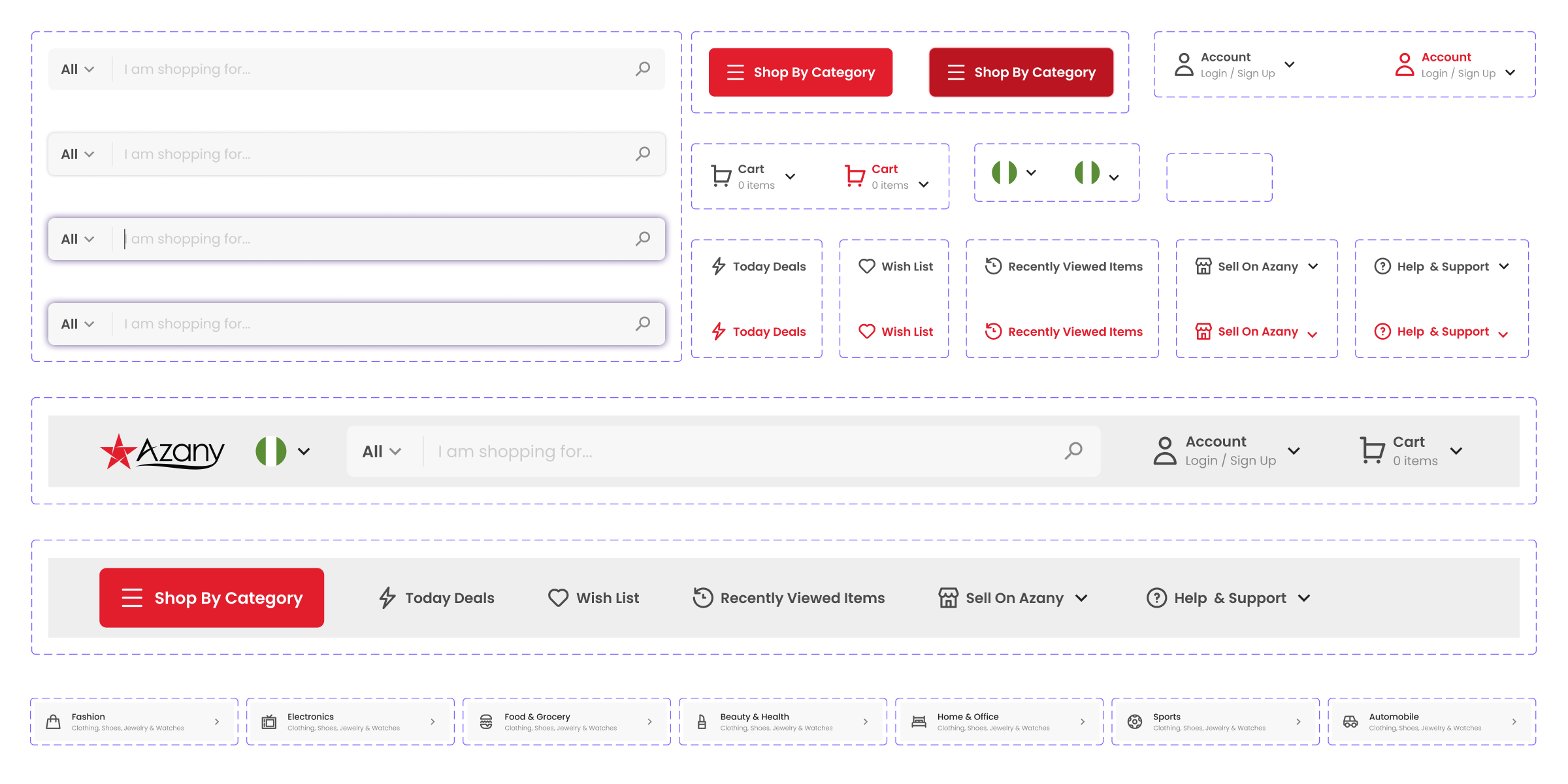
  • Familiar E-commerce Layout: Maintain a standard e-commerce structure (categories, search bar, cart) while clearly indicating the selected country.
  • Product Cards: Design product cards that clearly show the country of origin, estimated delivery time, shipping cost, and original price in local currency.
  • Robust Search and Filter System: Implement an advanced search function that allows users to search across all countries or within a specific country, with filters for price range, shipping time, and product categories.
  • Transparent Checkout Process: Create a step-by-step checkout process that clearly outlines shipping costs, taxes, and estimated delivery dates, plus other options.
  • User Profiles: Design user profiles that allow shoppers to save favourites (wishlist), track orders, manage international shipping addresses, and access their multi-currency wallet.
  • Vendor Dashboard: Create an intuitive vendor interface for product listing, order management, and earnings tracking.
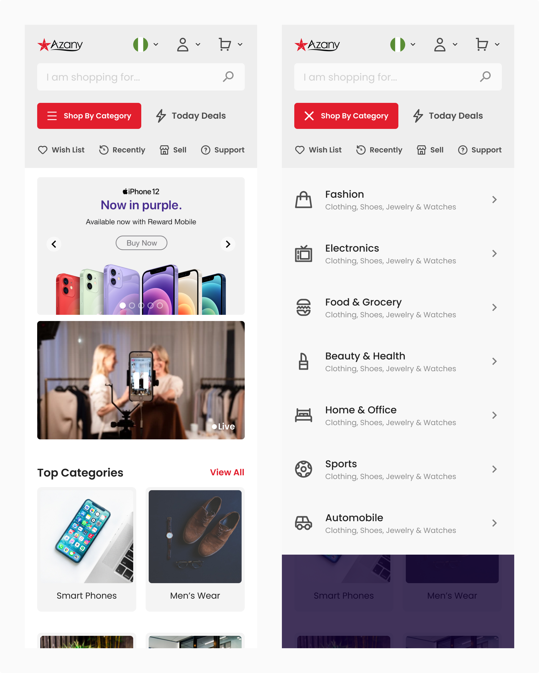
  • Mobile-First Design: Prioritize a responsive design that works seamlessly across devices, with special attention to the mobile experience.

Final Solution & High-Fidelity Design

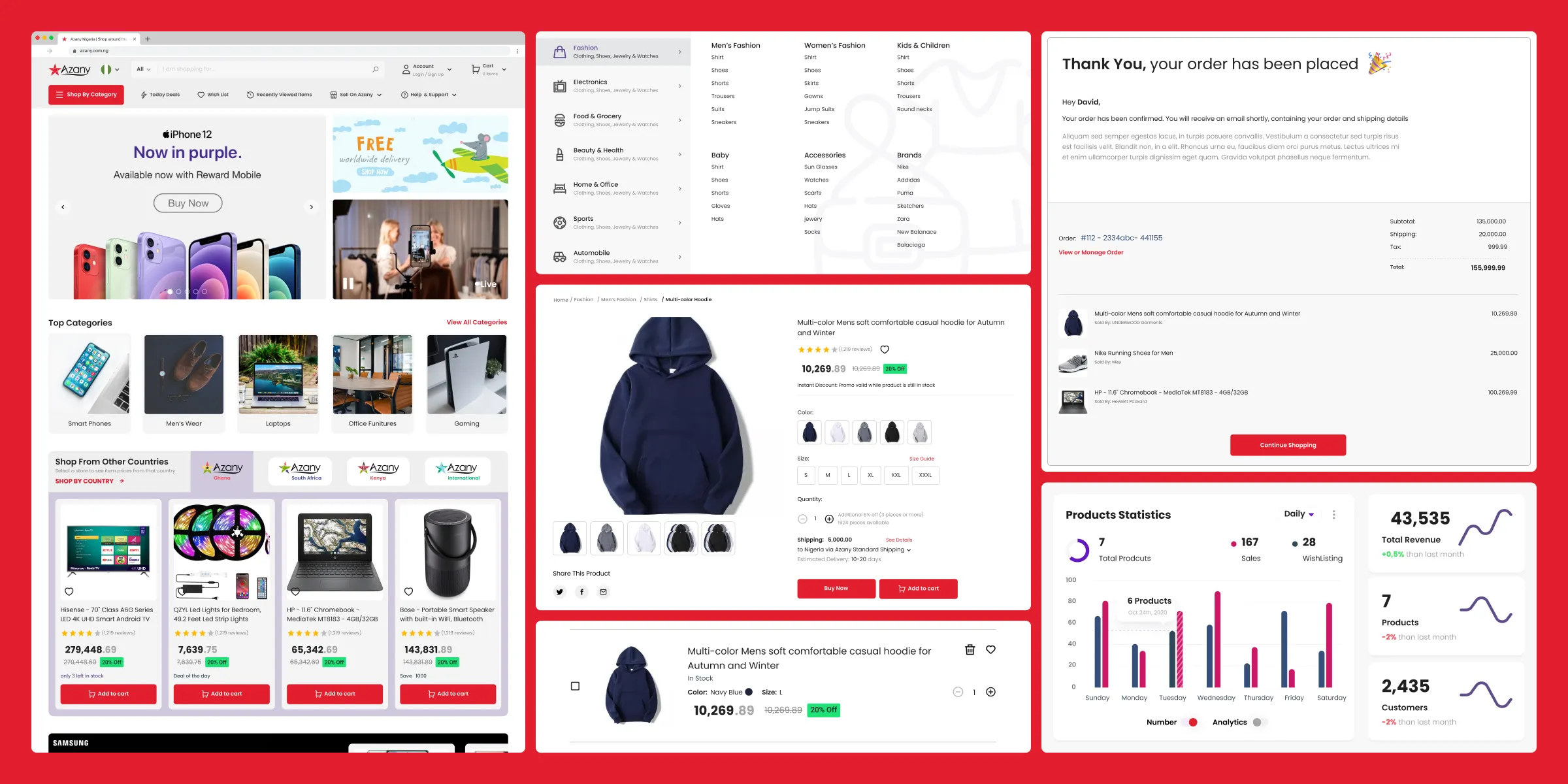
Here are some screens from the final designs:

Landing Page
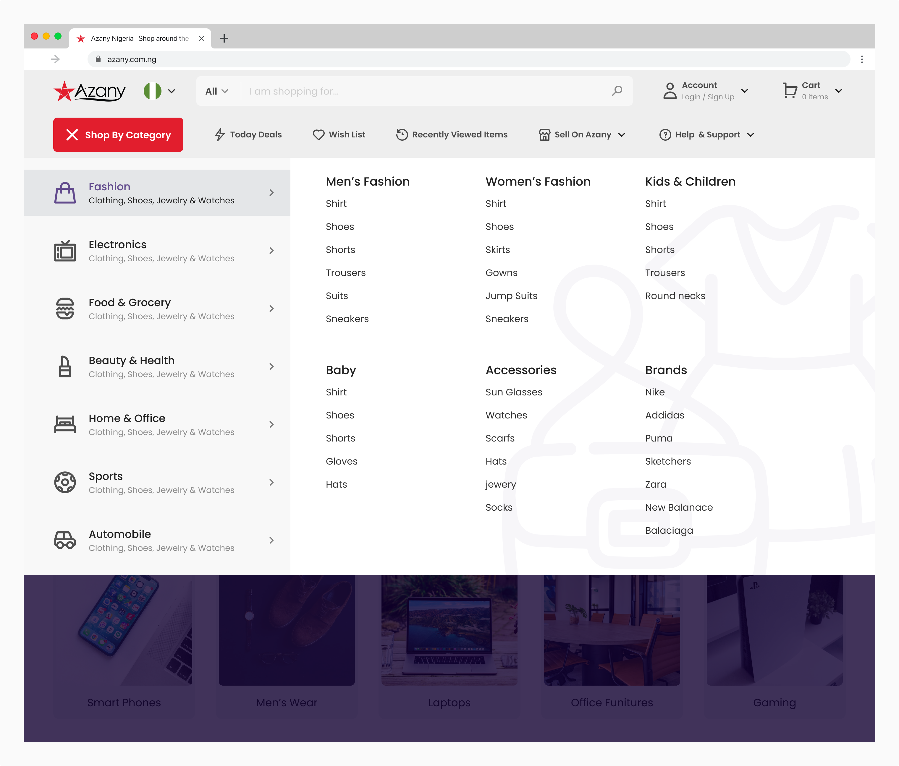
Categories
Search Results
Product Page
Vendor Page
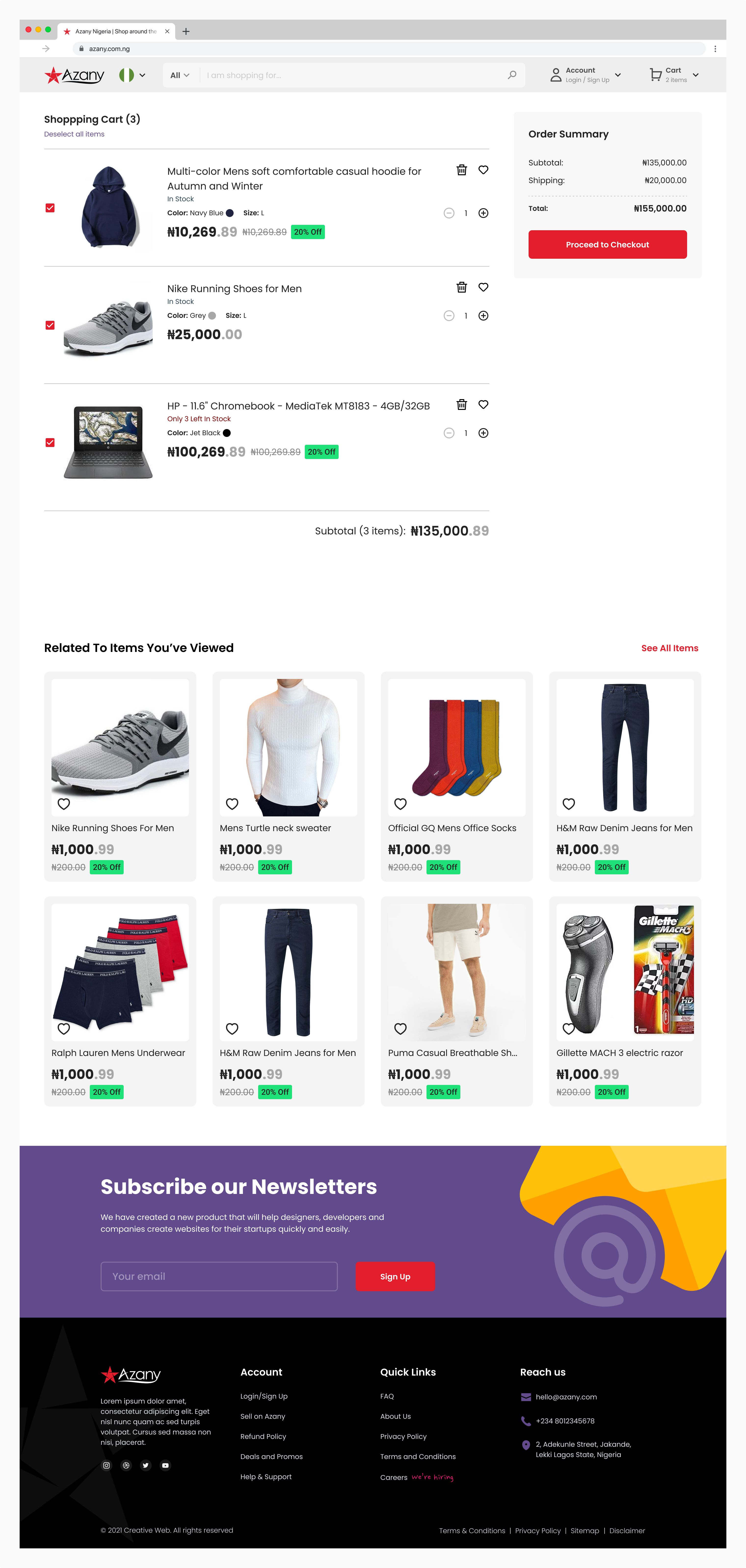
Cart
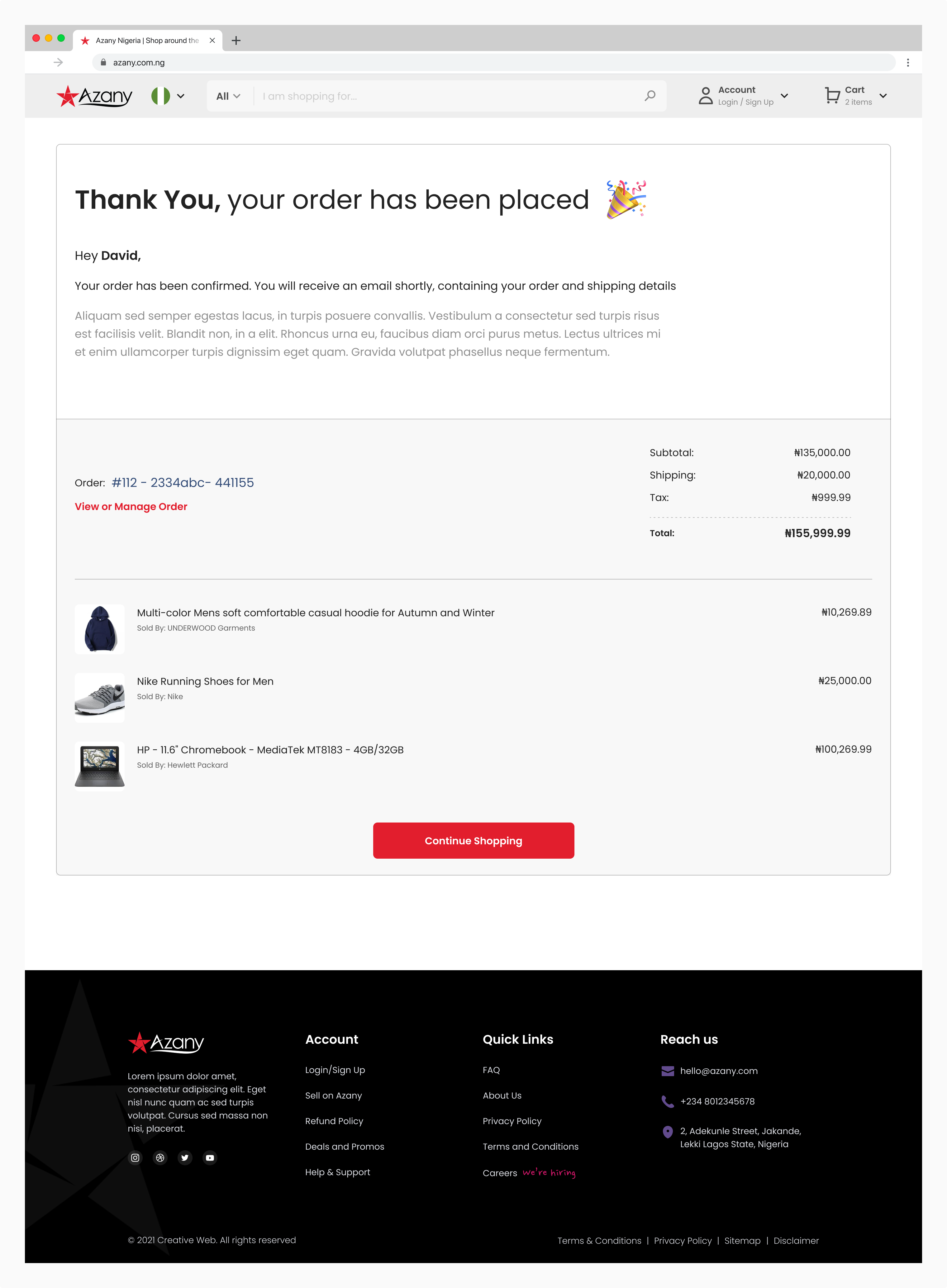
Order Placed
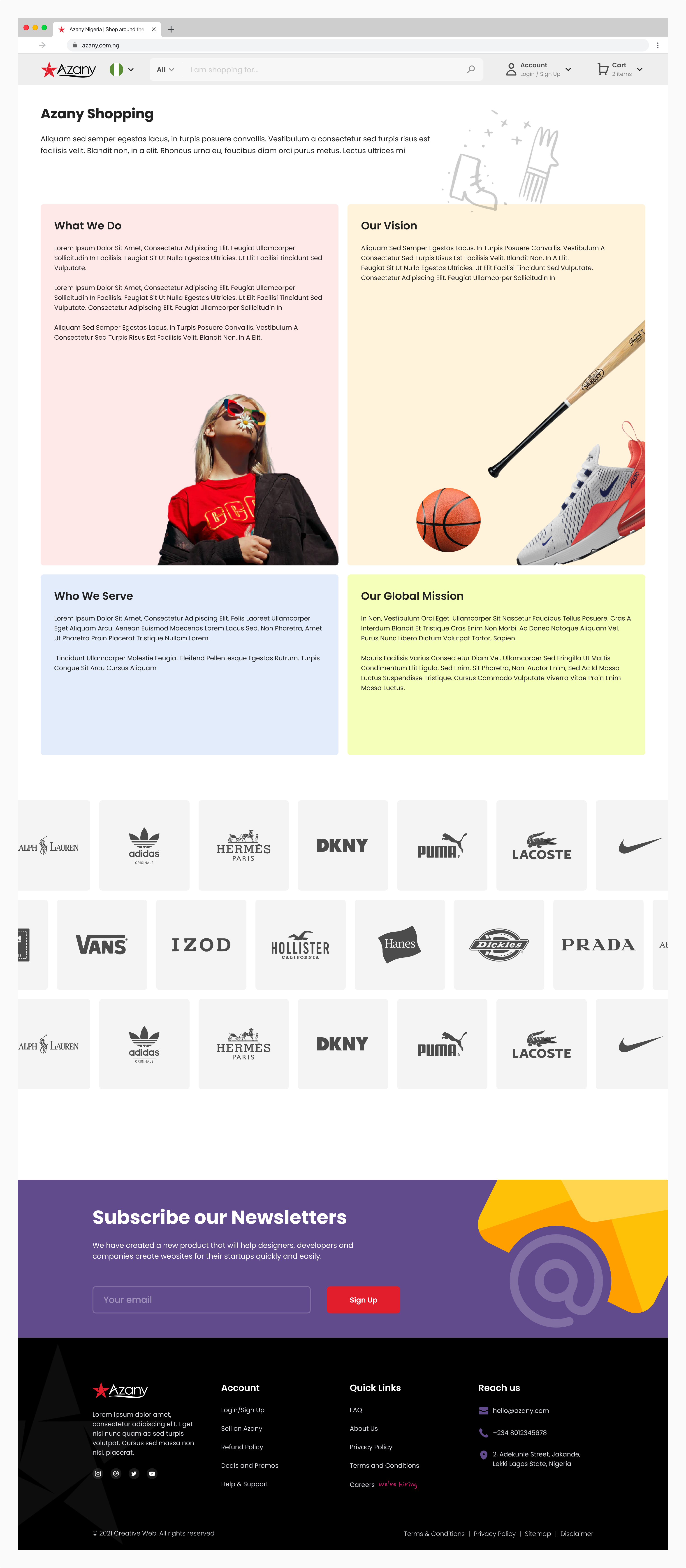
About Page
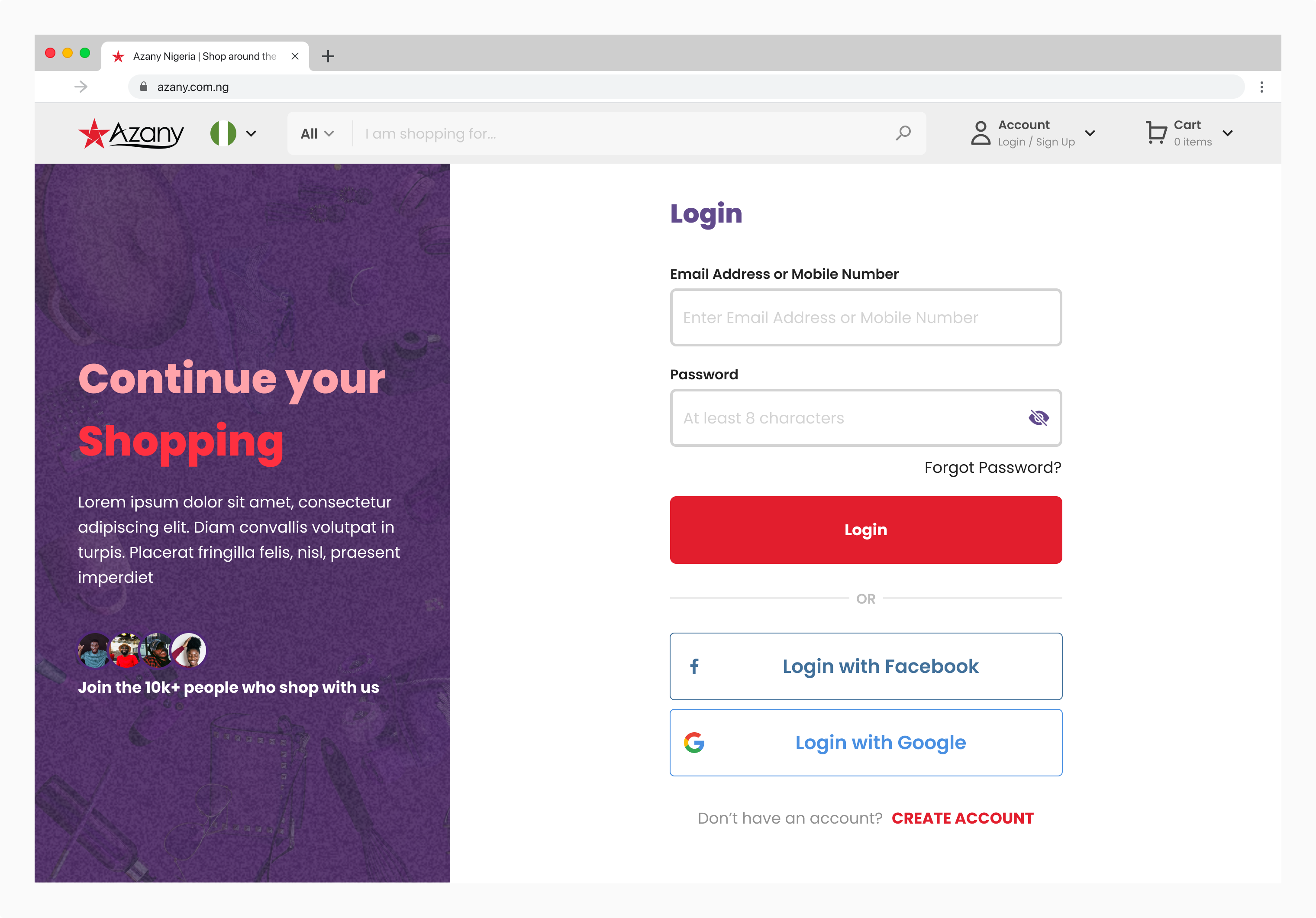
User Login
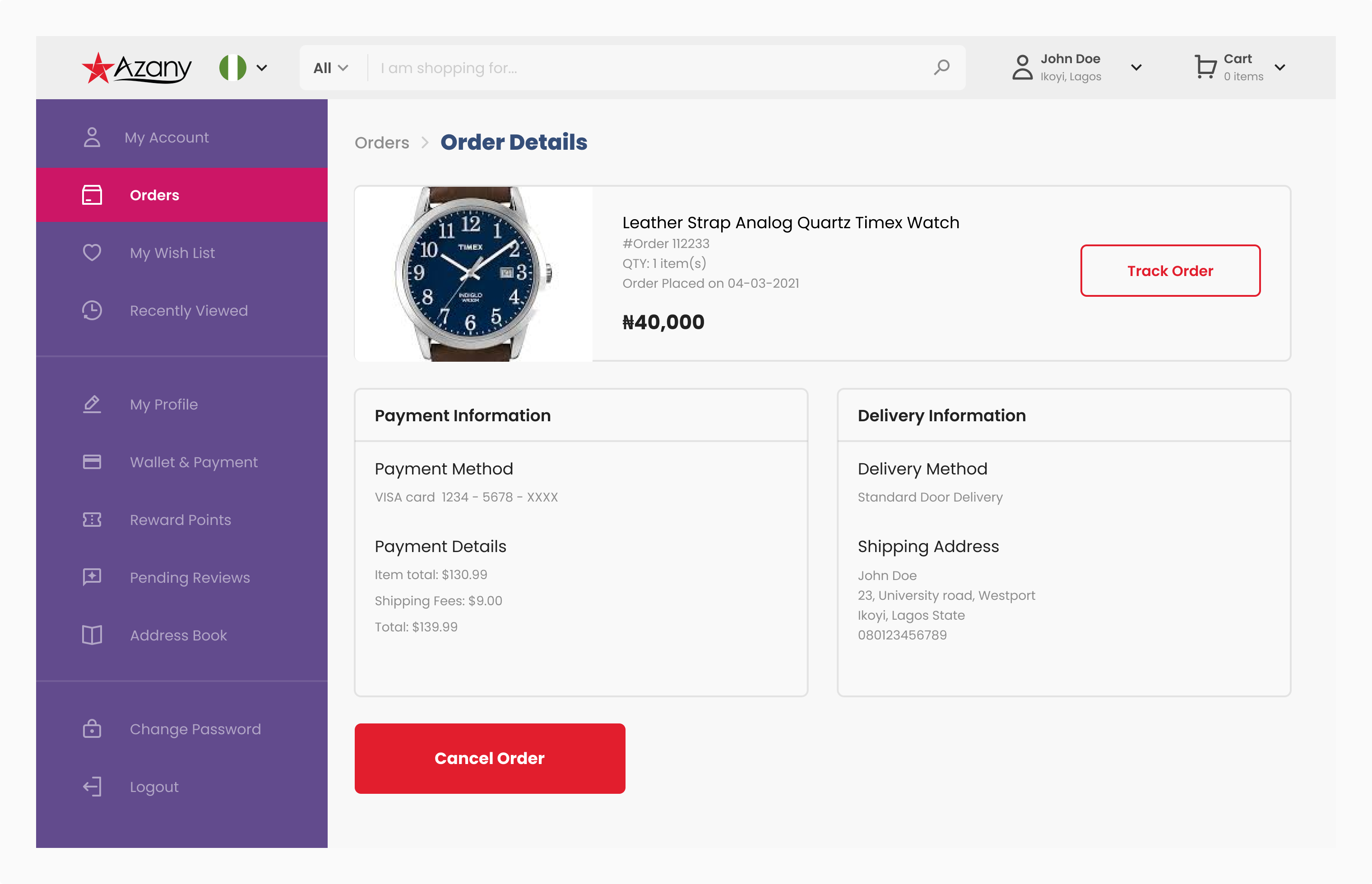
Order Details
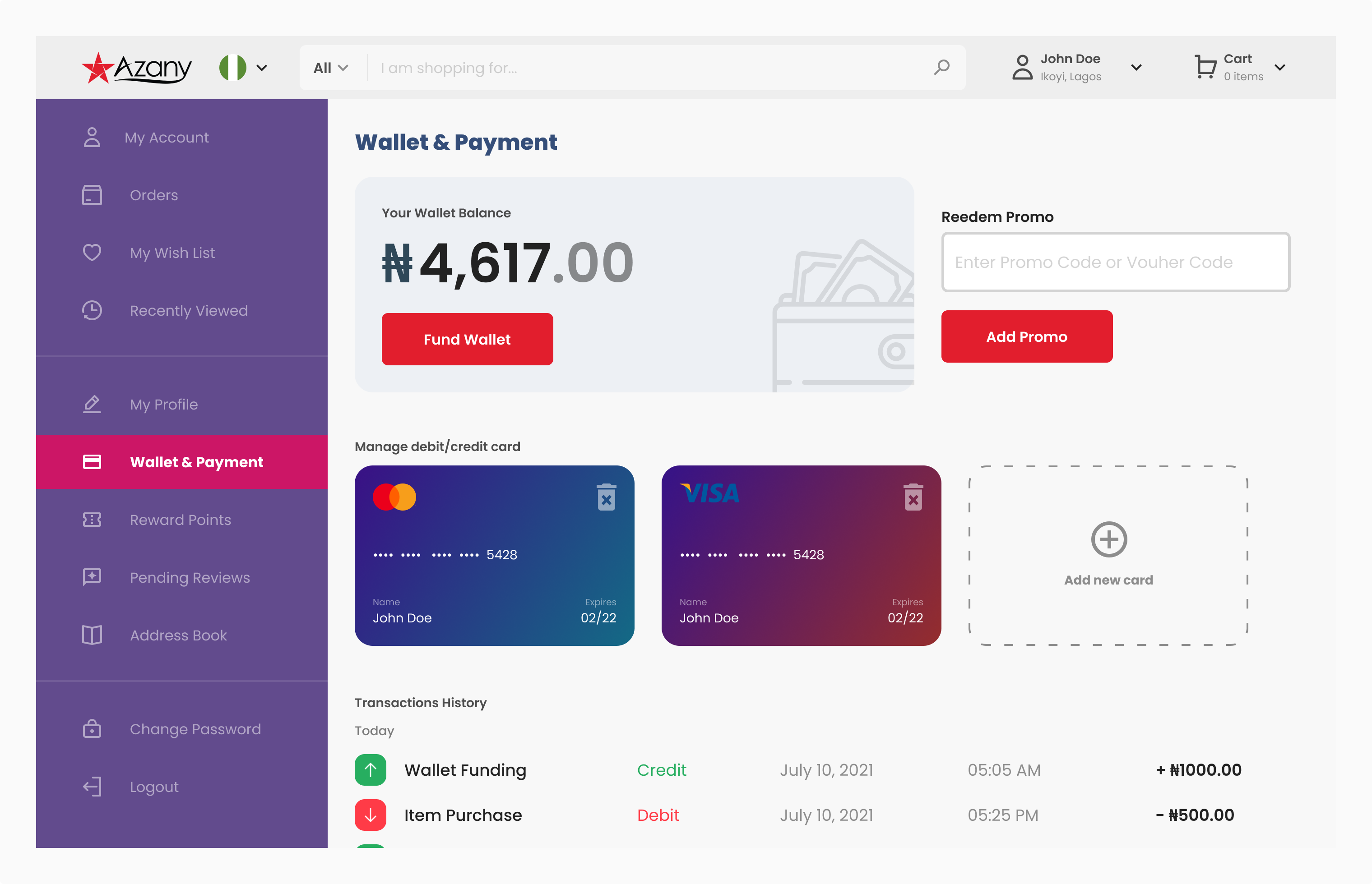
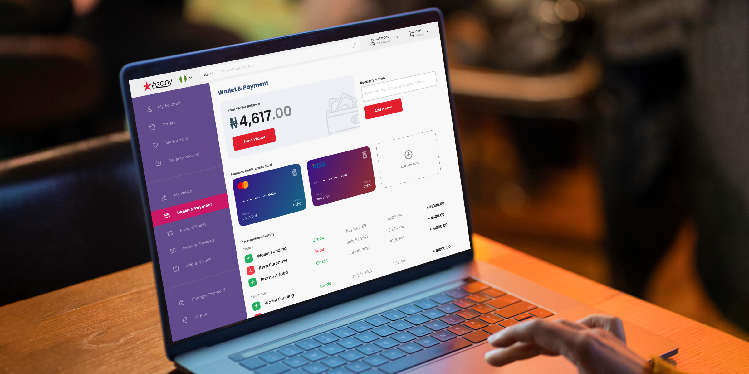
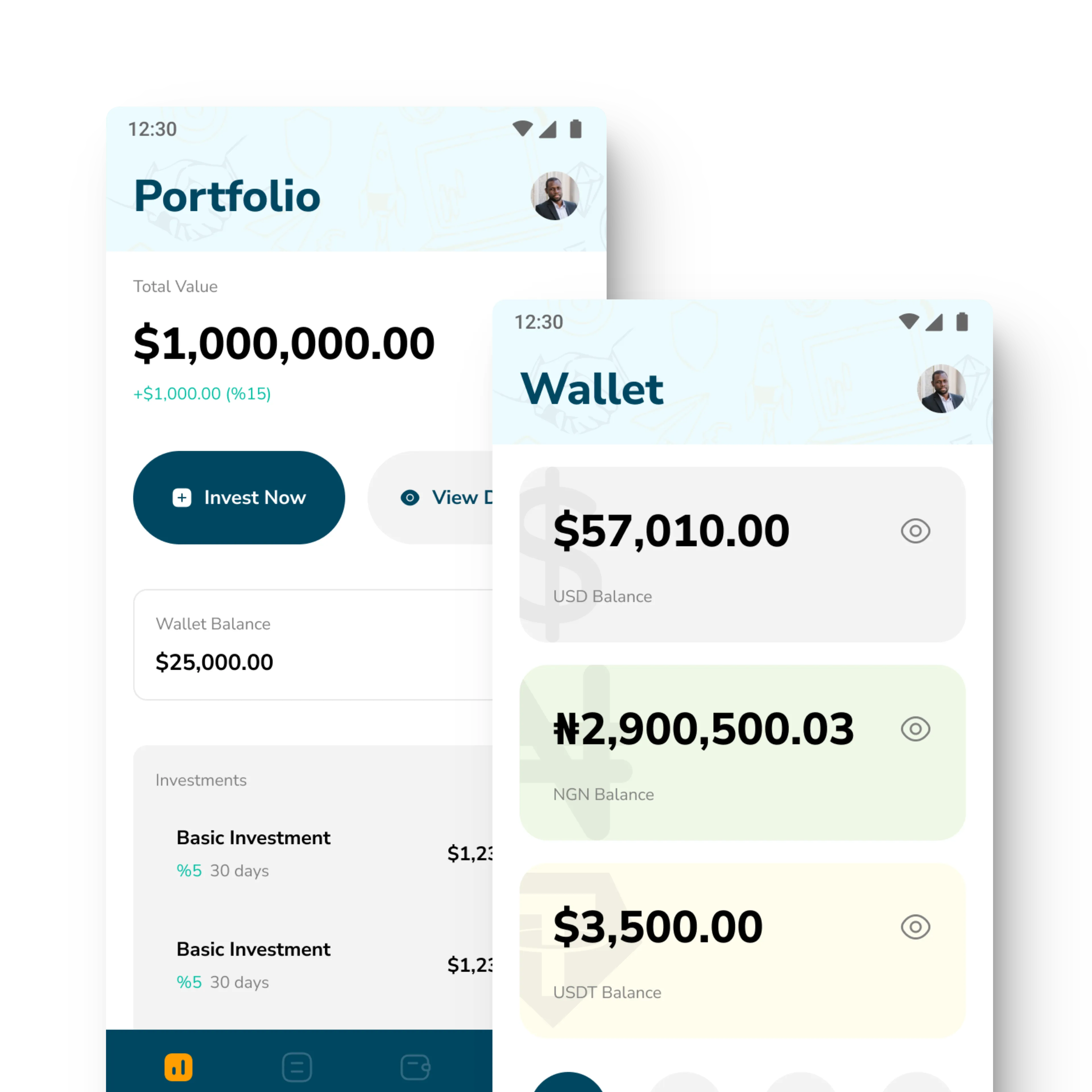
User Wallets
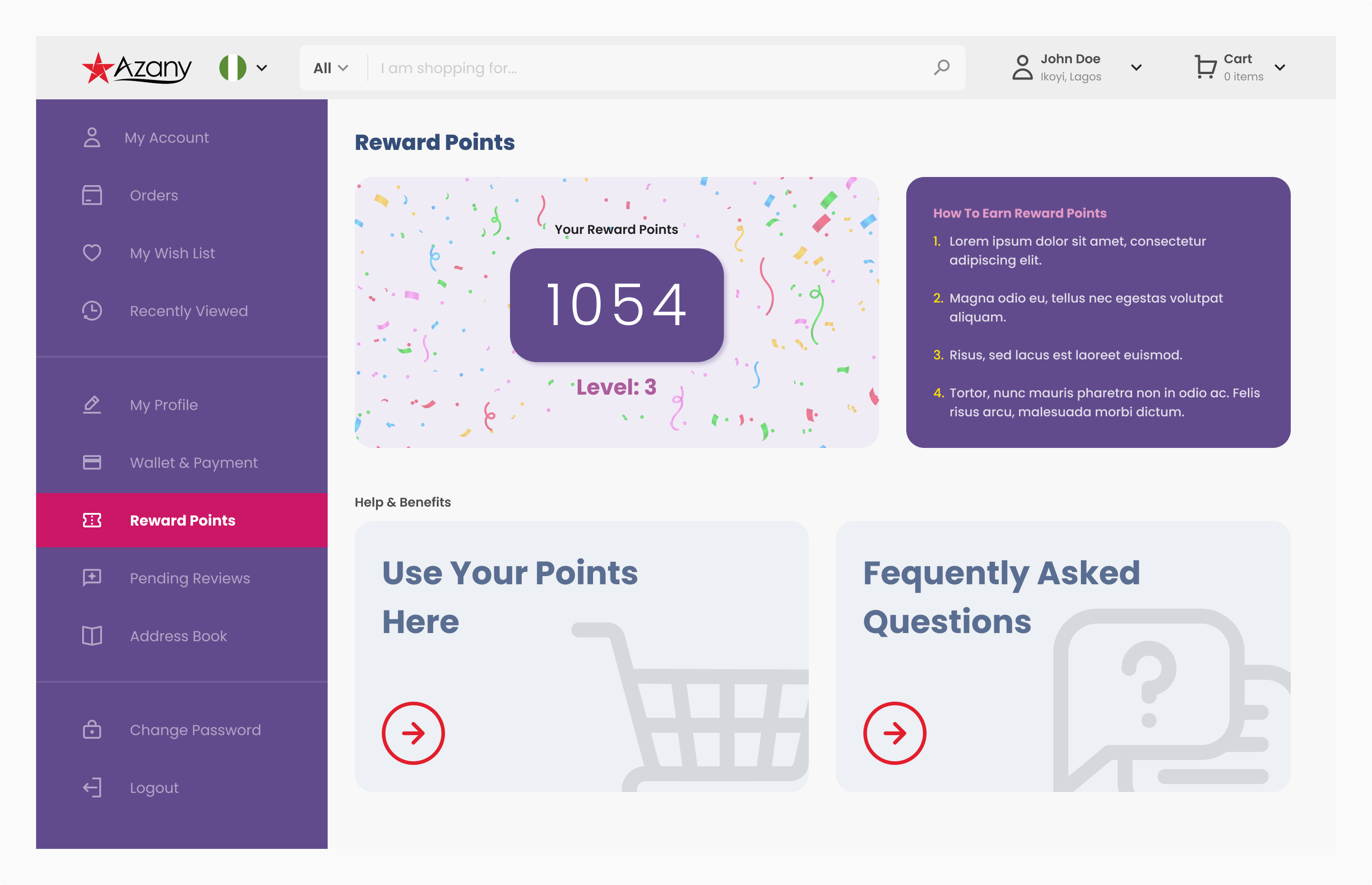
Reward Points
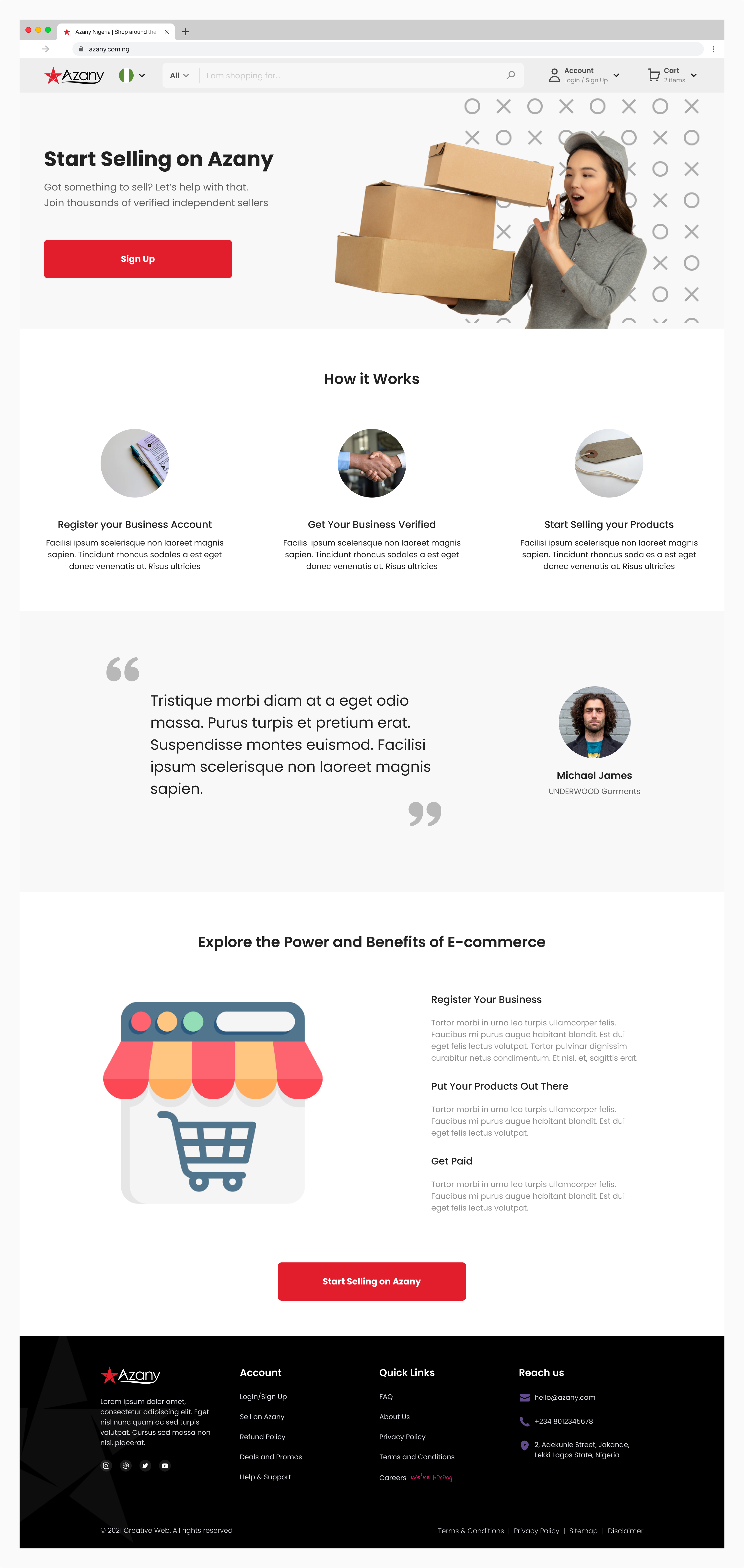
Vendor Landing Page
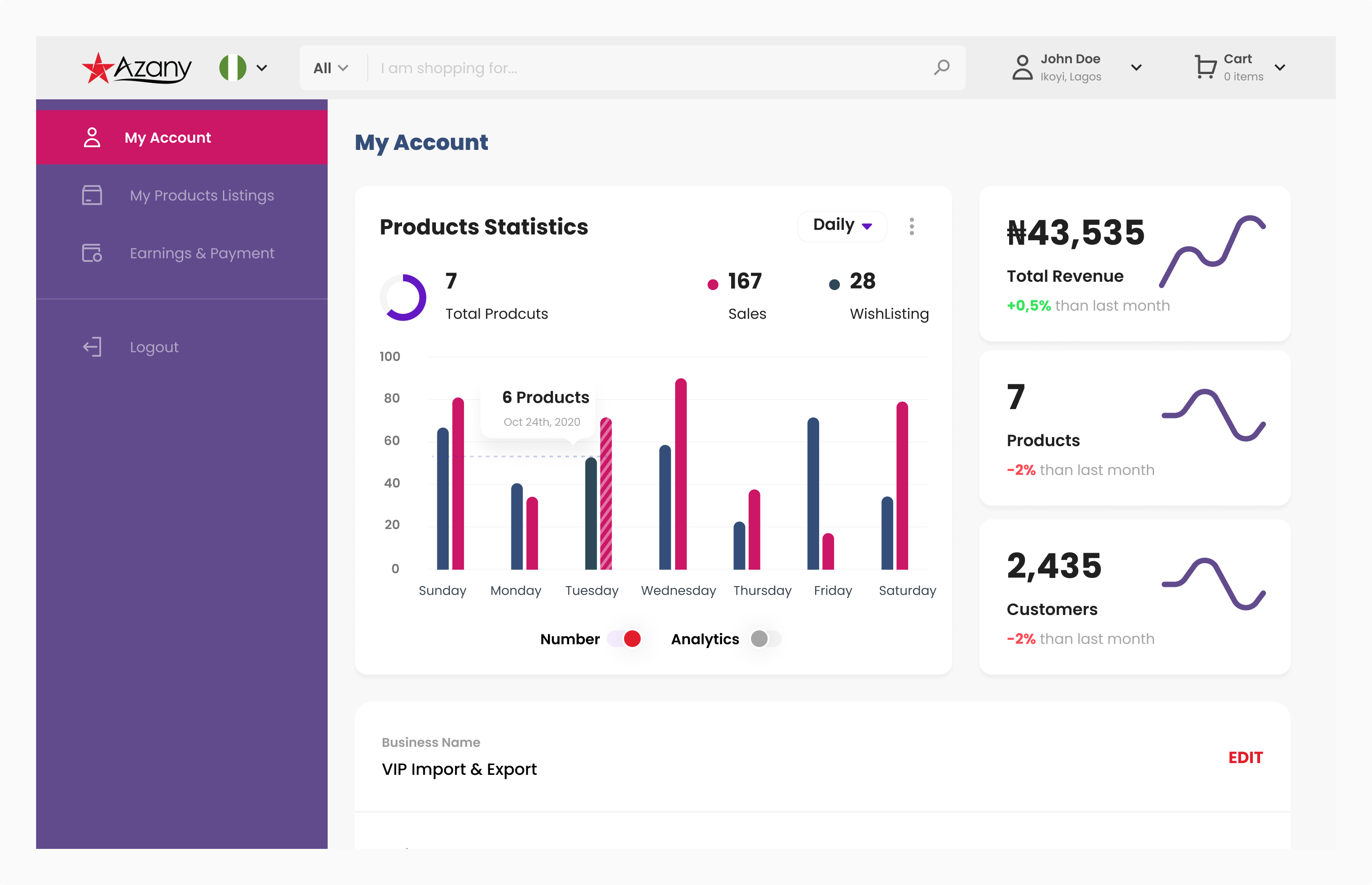
Vendor Dashboard
Also Responsive for Mobile
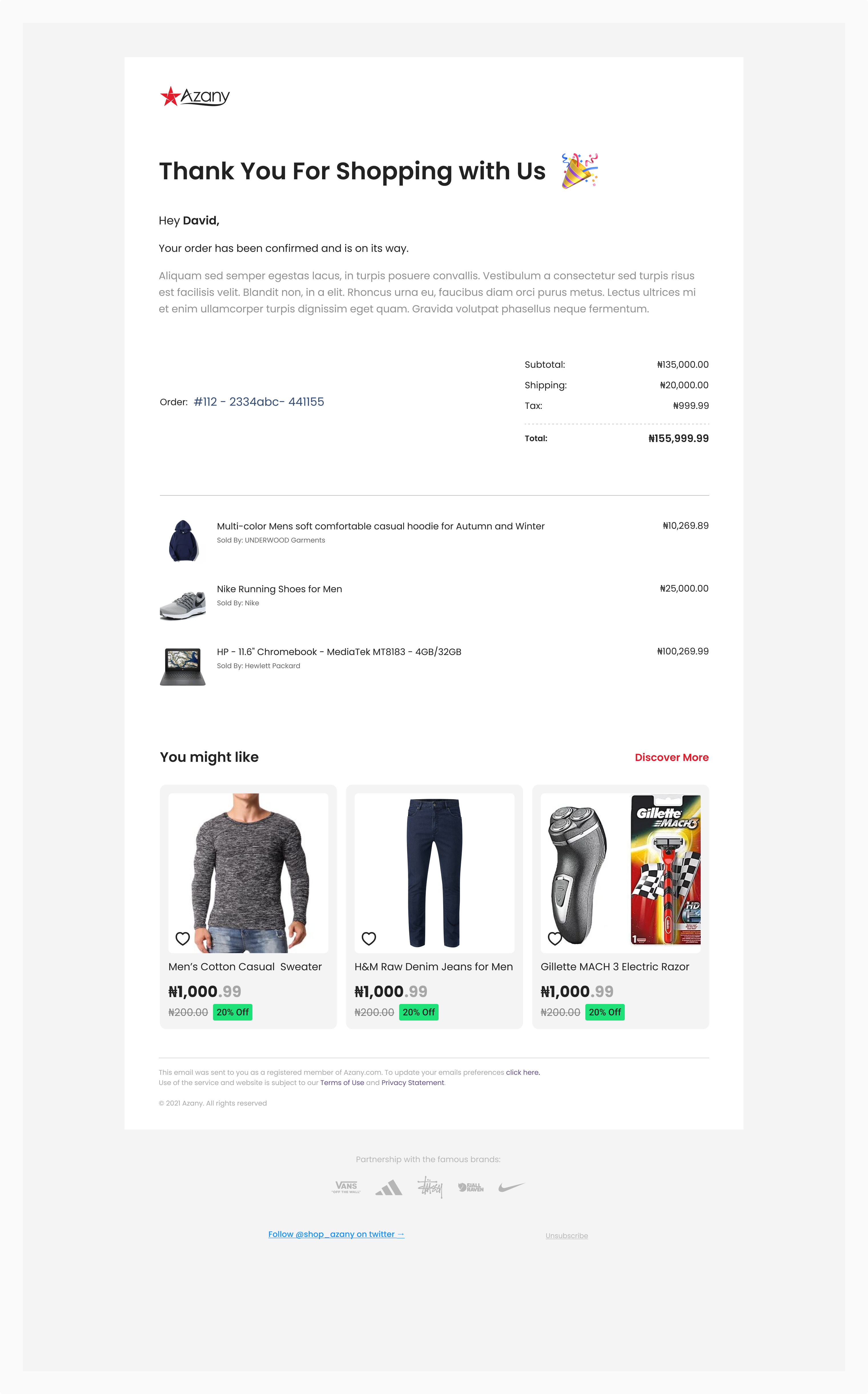
Order Confirmation Email Template
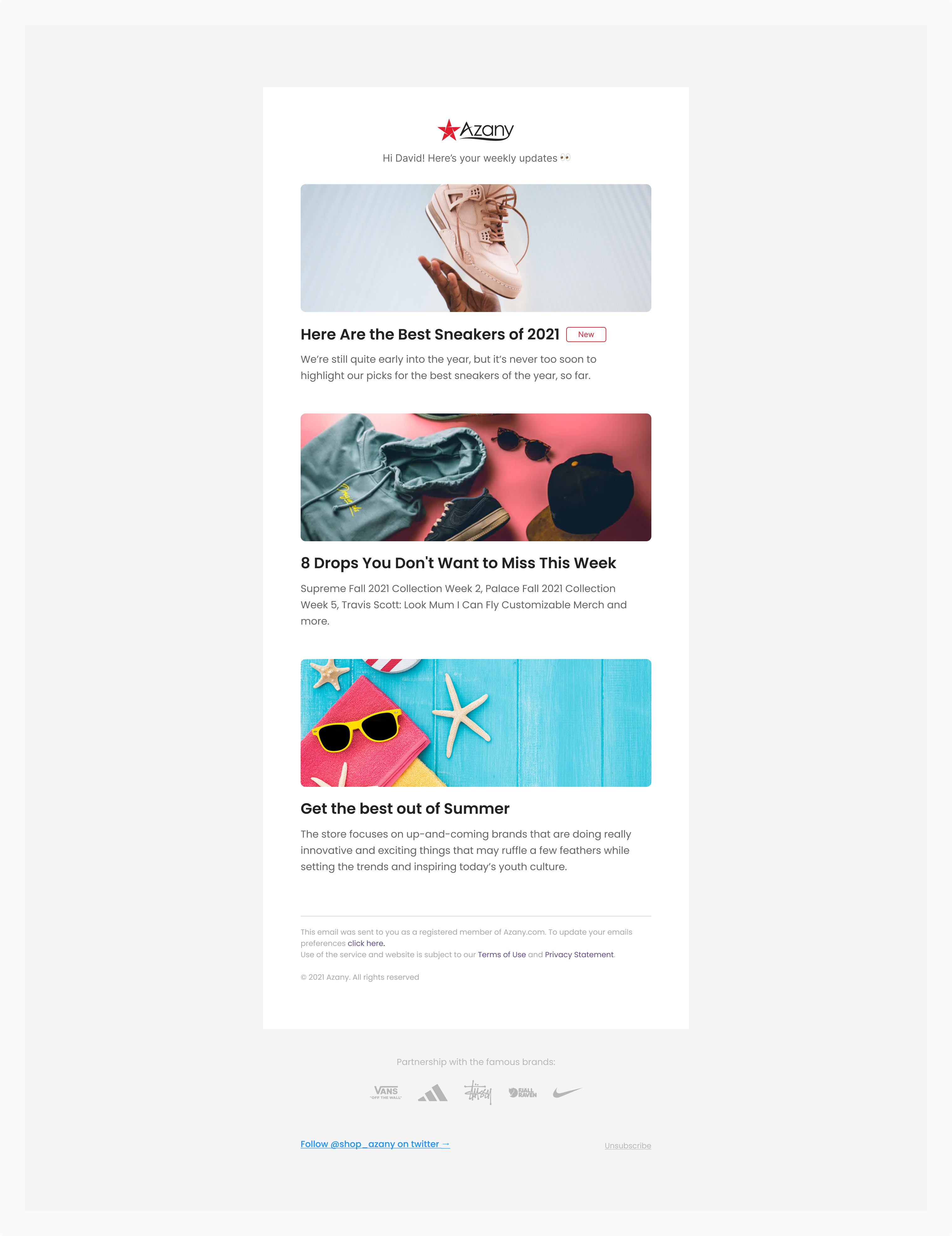
Email Newsletter Template

Prototype

User Testing & Refinement

The high-fidelity prototypes were used for extensive user testing to validate the design decisions. The testing process included:

  • Participant Recruitment: A diverse group of participants from multiple countries, including both frequent international shoppers and potential vendors, were selected.
  • Usability Testing Sessions: Conducted both in-person and remote testing sessions, asking participants to complete key tasks such as finding products from specific countries, comparing shipping options, completing the checkout process, and (for vendor participants) listing a product and reviewing sales analytics.
  • Data Analysis & Iteration: User feedback was carefully analyzed, and the design was iteratively refined to address usability issues and enhance the overall user experience for both shoppers and vendors.

Key Learnings from User Testing

  • Country Selection: Users appreciated the visual map interface but requested a quicker way to switch between frequently shopped countries.
  • Product Information: Participants emphasized the need for detailed product descriptions in multiple languages, especially for unfamiliar international brands.
  • Shipping Transparency: Users expressed a strong desire for clear, upfront information about shipping costs, delivery times, and potential import duties.
  • Vendor Experience: Vendors requested more detailed analytics and the ability to set different prices for different target countries.
  • Trust and Authenticity: Both shoppers and vendors expressed concerns about ensuring product authenticity and protecting against fraud in international transactions.

Addressing User Feedback & Final DesignBased on the user testing insights, several refinements were made to the final design:

  • Enhanced Country Selector: Added a "Quick Switch" feature allowing users to toggle between their top 4 most shopped countries.
  • Improved Product Pages: Expanded product descriptions with automatic translation options and added a section for user reviews from international buyers.
  • Shipping Calculator: Implemented a prominent shipping cost and time calculator on product pages and in the shopping cart, including estimates for import duties.
  • Simplified Currency Management: Redesigned the wallet interface to make currency conversion more intuitive, with clear visualizations of exchange rates.
  • Advanced Vendor Tools: Enhanced the vendor dashboard with more detailed country-specific analytics and flexible pricing options for different markets.
  • Trust Badges and Verification: Introduced a system of trust badges for verified international sellers and clear buyer protection policies.
  • Community Features: Added a community section where users can share their international shopping experiences and tips.

Conclusion

The Azany e-commerce platform project demonstrates the power of user-centered design in creating a complex, yet intuitive solution for international online shopping. By prioritizing user needs, conducting thorough research, and iterating based on diverse user feedback, we developed an interface that simplifies the process of shopping from multiple countries while empowering vendors to reach a global market.

Key achievements include:

  • An intuitive country selection interface with quick-switch functionality
  • Clear presentation of international shipping information and costs
  • A familiar e-commerce layout enhanced with country-specific features and multi-currency support
  • Robust search and filter options for efficient product discovery across global catalogs
  • A comprehensive vendor dashboard for managing international sales
  • Innovative features like AR product visualization and a community platform to enhance user engagement

As Azany continues to grow, ongoing user testing and refinement will be crucial to maintain its effectiveness and appeal to a global audience. This project underscores the importance of understanding diverse user needs and expectations in designing e-commerce solutions for an increasingly interconnected world.

Future considerations include expanding language support, integrating with more local payment systems, and developing AI-powered personalization features to recommend products based on users' international shopping patterns.

More Projects