To kickstart the project, I focused on defining clear objectives that would guide the design and development process. The main objectives were:
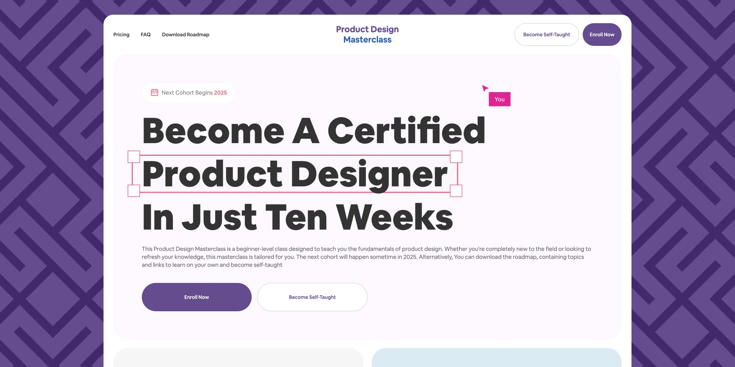
- User-Friendly Experience: Ensuring that visitors can navigate the site effortlessly and find key information without friction. This included creating a logical flow of information from the hero section to actionable CTAs.
- Visual Engagement: The site needed to stand out with a clean, modern, and appealing design that reflects the creativity and professionalism of product design.
- Persuasive Messaging: By strategically placing compelling content, I aimed to motivate users to take action—whether by enrolling directly or downloading the self-taught roadmap.
- Clear Call to Action (CTA): The goal was to reduce decision-making friction for users by placing prominent and consistent CTAs, such as "Enroll Now" and "Download Roadmap."
This phase clarified the project’s purpose and ensured the design choices aligned with achieving high engagement and conversions.
To create a tailored experience, I identified the primary target audience:
- Aspiring Product Designers: People new to the field who are looking for structured guidance and a beginner-friendly learning path.
- Beginners: Individuals with little or no design background but eager to learn the fundamentals of product design in an accessible format.
- Upskilling Professionals: Working professionals or designers looking to sharpen their skills or transition into product design from adjacent fields like graphic design or marketing.
Understanding their needs helped in prioritizing features:
- Simple and jargon-free language for beginners.
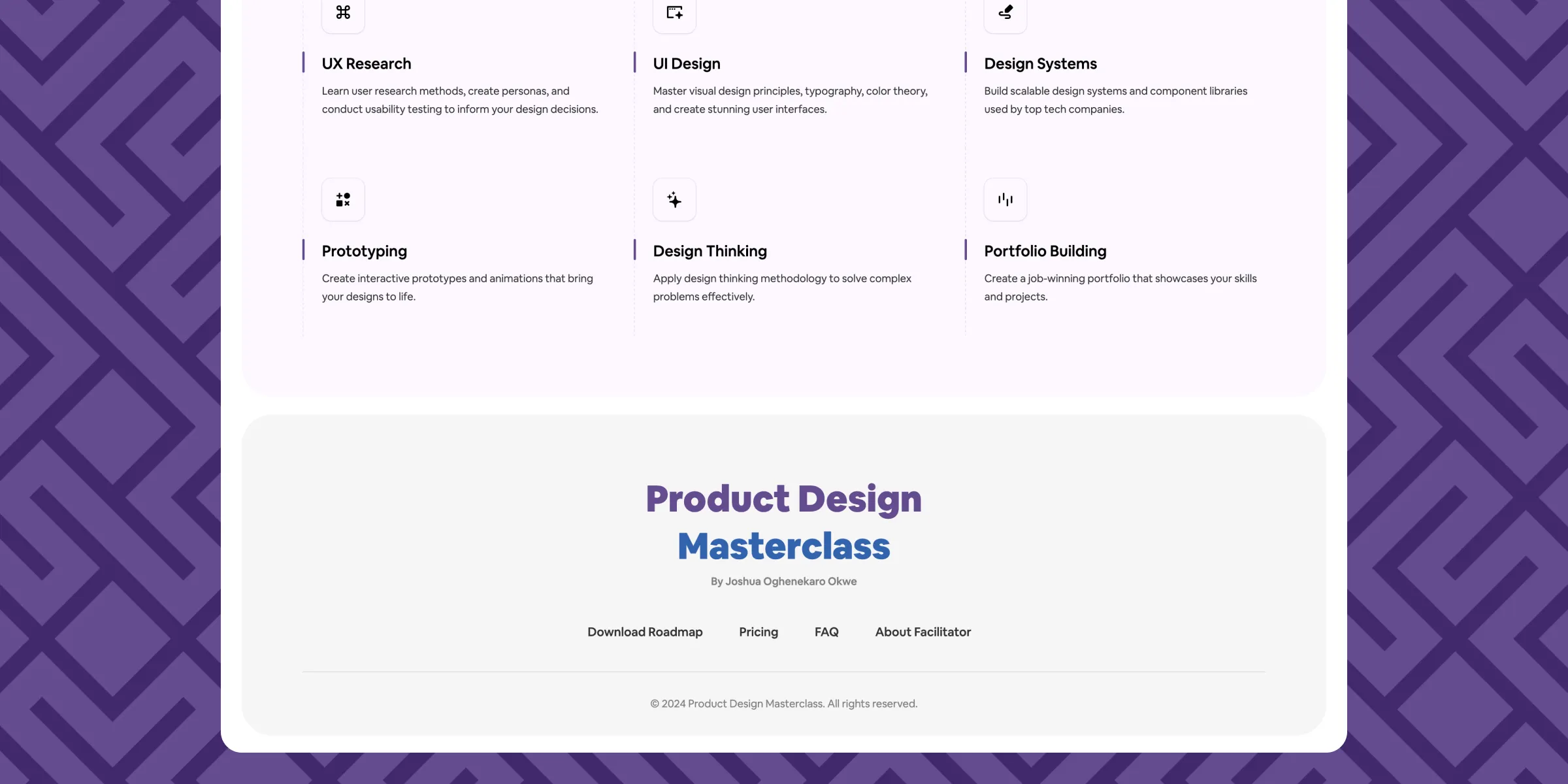
- A structured breakdown of what students would learn, with an emphasis on practical skills.
- Testimonials and success stories to build trust and provide social proof for professionals hesitant about investing in the program.
Analyzing competitors allowed me to identify key elements that make similar course websites effective while spotting gaps to differentiate this masterclass. The analysis covered:
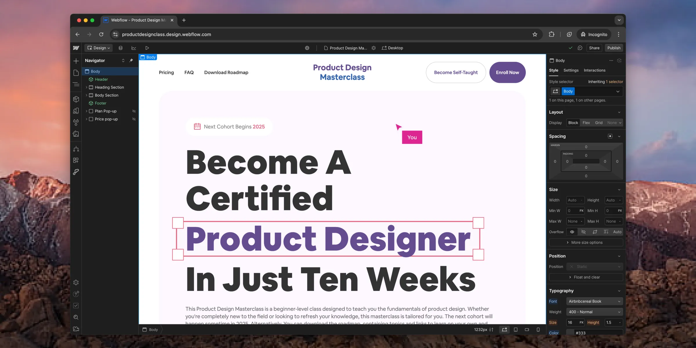
- Clear Value Propositions: Competitor sites often use a bold headline to immediately communicate the benefits of the course. This inspired the "Become A Certified Product Designer in Just Ten Weeks" headline.
- Compelling Visual Hierarchy: I noticed that effective websites used strategic spacing, typography, and color to guide users’ attention. I incorporated this by ensuring the most critical elements, like benefits and CTAs, were visually emphasized.
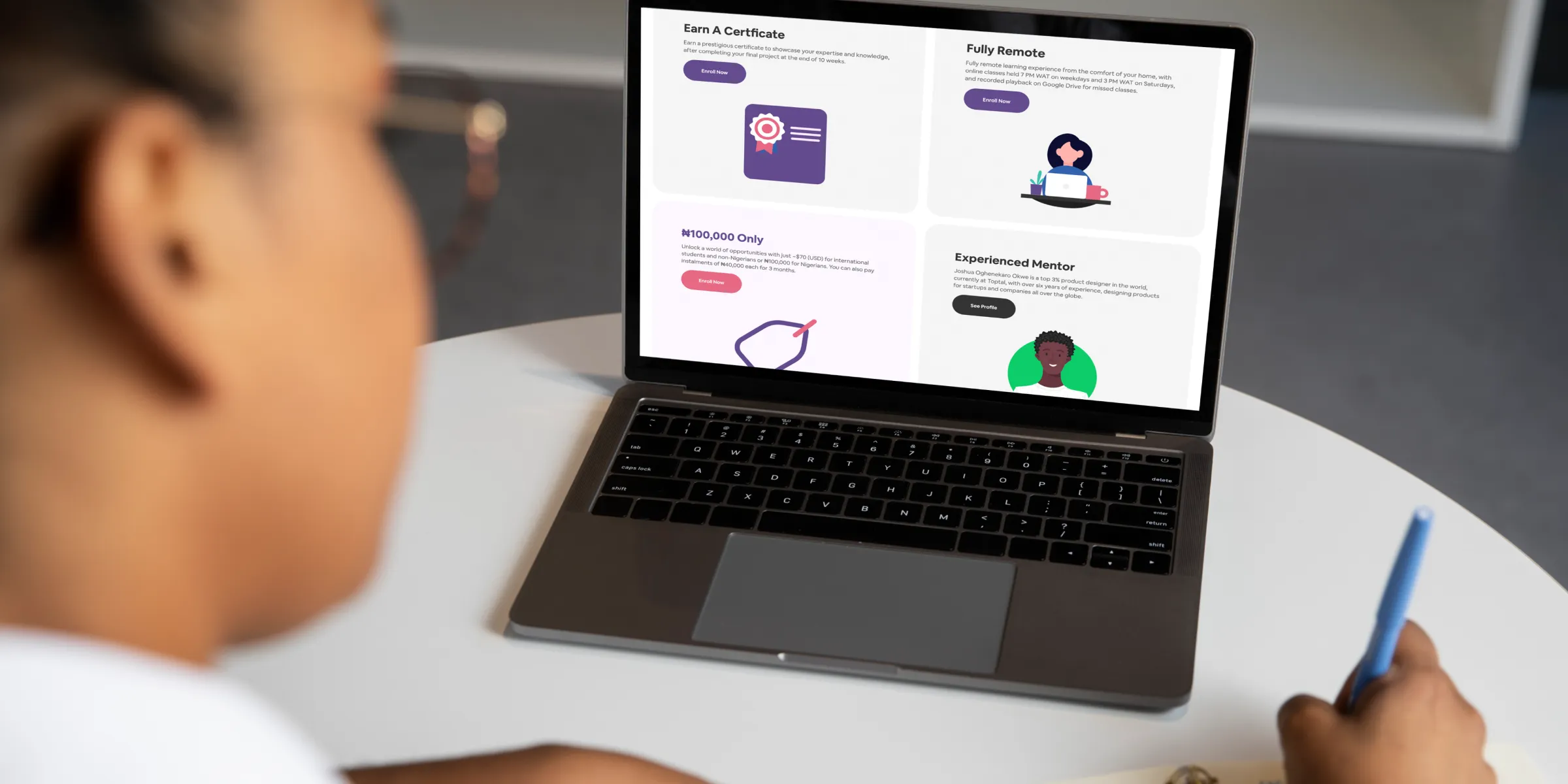
- Content Organization: Successful course websites structure content logically, leading users through the story of "why this course" and "how it works" in sequential steps. This informed my decision to create sections for program benefits, mentor experience, and testimonials.
- Conversion-Optimized CTAs: Top-performing websites had prominent CTAs placed at key points. I applied this insight by integrating "Enroll Now" buttons at strategic locations, such as the hero section and after testimonials.
Additionally, I identified areas where this site could stand out:
- Affordability Highlight: Competitor courses often obscure pricing. By prominently featuring the ₦100,000 price tag alongside the program's value, I aimed to appeal to budget-conscious users.
- Self-Taught Option: Adding a "Download Roadmap" option offered flexibility for learners who prefer a DIY approach, addressing an untapped segment.

